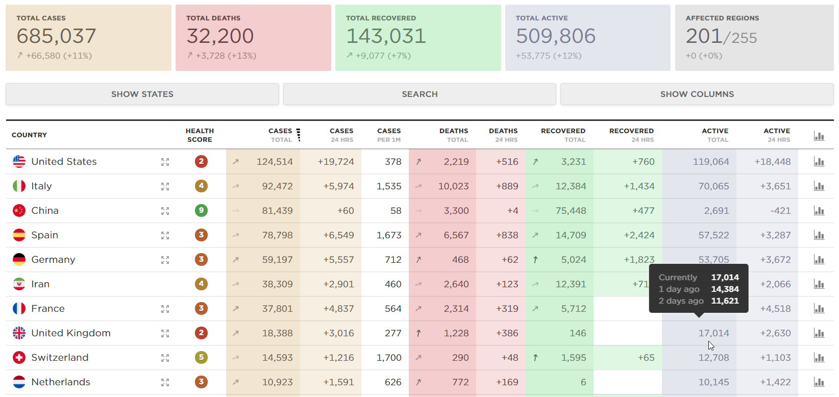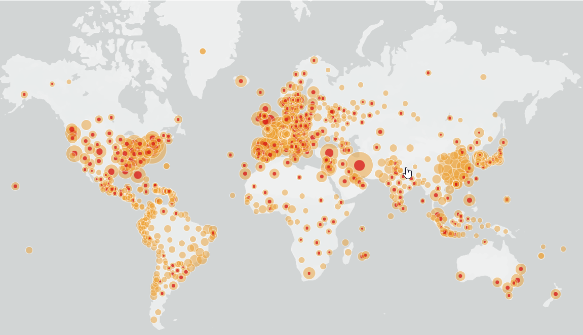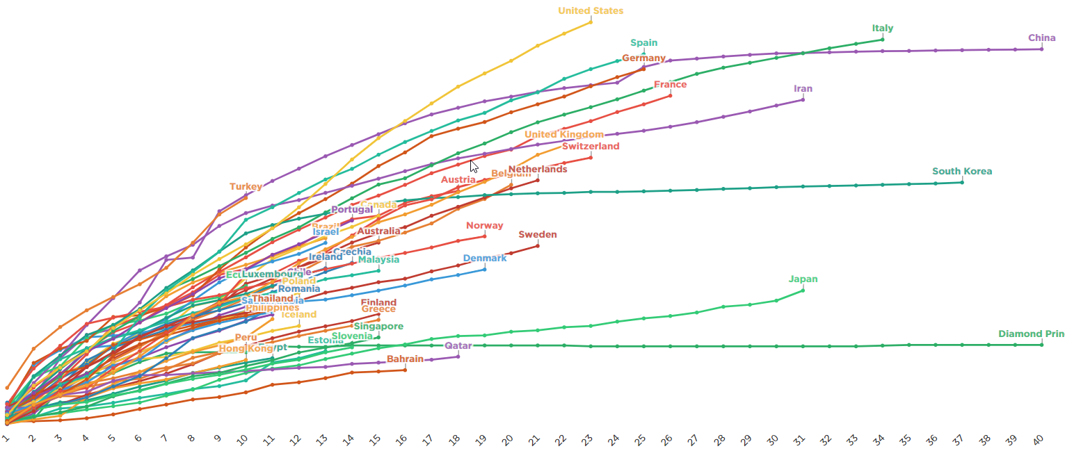
Alexey Pakhomov has built a meta aggregator of data from multiple sources such as the Johns Hopkins CSV, Johns Hopkins Dashboard, WHO Situation Data, Worldometer and Wikipedia to power his meta-visualisation tool at Covidly.com
A Map, Graph and Summary pages feature rich data visualisation. The pages are being updated with new features.
The data could be filtered by Country, States and other details.